Squirrly Seo
Brand Identity Guide
Background colors
Main colors
#1d3c4f
#f7f5f2
#6221ea
Secondary colors
#50ae54
#d13135
#89999a
#1D1E24
#fec63d
If there is a series of pages, keep the same background color for consistency.
Photography
Photography is usually used as a background with a solid color at a certain opacity over it.


In some cases, you can use photography as it is (if you talk about a service, for example). Or if it works as a background as it is, and the text is still legible. It will also be used as it is for featured image for a blog post and inside of blog posts.
The photos should be downloaded from unsplash.com and resized before being used.
You can also use the photos made for Squirrly in-house. (ask for access)
Other Graphics
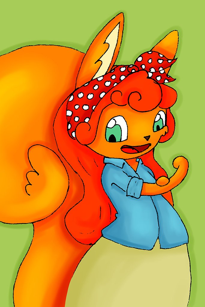
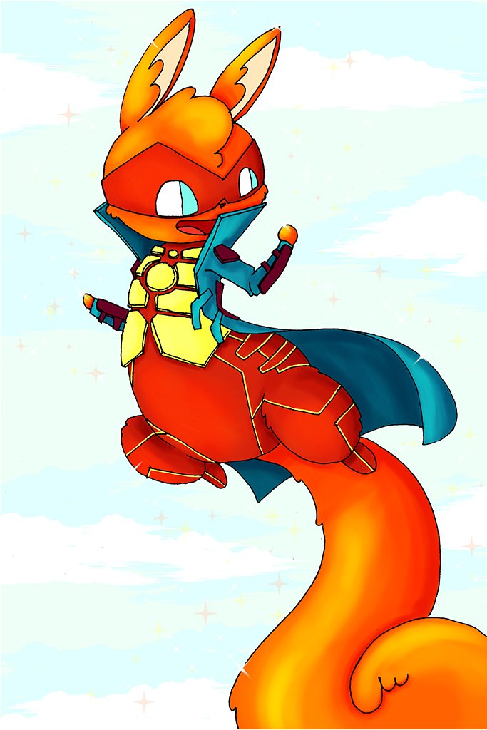
You should use the Squirrly Mascot when appropriate.
You can ask for access for illustrations already created or ask for them to be created.

User Interface
Please see the Typography, Color, Photography and Other Graphics section as well for more information and to ensure consistency.
plugin.squirrly.co/wordpress/seo/
Page Atributte:
Please use “Fullwidth Page Templates” plugin and choose “FW Fullwidth No Header Footer” as Page Template.
Section:
Please try to use only the main background colors. If you need a more special background, you can use an image with a solid color over it at an opacity that will allow the text to still be legible.
Row:
You should change the sizing to 80% or 60% according to the design you try to achieve. In special circumstances, you can let the sizing be at 100%.
If you need to change the “Spacing,” please do so on the biggest desktop you have access to and also use vw instead of px.
Full widht image:
In order to achieve this effect, you should add the image as a background to the element where you want this to take place. It should usually be in the “Section” part. After, you should change the size from the “Spacing” settings. Please use vw instead of px.
Button:
You should use custom Style for Buttons. The font size should be 20px, the color should be white for dark backgrounds and grey for light backgrounds. If the button is yellow, please use the #edf000 shade. The border radius should be 100%, but this can be changed according to the design. The font weight should be bold. You can use an icon if it helps the design. If not, please let it be simple. If you need to make the button larger, you can use the “Spacing” setting. Please use vw instead of px.
If the button does not send to an outside link and it should go to a section in the page, you should go to the section you want the button to go, and in the “Advance” section, “CSS ID & Classes,” you should add an ID. After that, you should go back to the button. To link, you should type “#” and the ID you added. For example, if the ID is “cat,” then you should write “#cat” in the button link.
Email optin:
For the title, use: “I use Squirrly every time I create a new post.” For the button text, you should use whatever the design dictates. For description, use: “– Neil Patel, Co-Founder of KissMetrics” And for footer, use: “Over 2,345,000 Downloads”
For “Email account,” you should talk with the person in charge to get these details.
For “Field,” we don’t usually need the name fields. And for “Success action,” you should talk with the person in charge to see if you should have a redirect link.
And no background.
For the colors, please use the main typography colors.
The “Title text” should be H2, semibold and centered. It should be the grey or white color, the size should be 27px, the letter spacing should be 1px and the line height should be 1.5em.
The field text should be grey or white according to the background. It should be regular, the size should be 16px, the letter spacing 1px, and the line height 1.5em.
The body text should be grey or white, it should be regular, the size should be 16px, the letter spacing 1px and the line height 1.3em.
For the button, please use the same settings as written before.
If you need to change the “Sizing” or the “Spacing,” please do so on the biggest desktop you have access to and please use vw instead of px.
Text:
H2: The text should be Bold, the color used should be one of the main typography colors. You can use another color only in extreme cases where the color would help the text. The size should be 40px and the line height should be 1.5em.
H3: The text should be Bold, the color used should be one of the main typography colors. You can use another color only in extreme cases where the color would help the text. The size should be 30px and the line height should be 1.5em.
Paragraph: The text should be regular, the color should be either white for a dark background or grey for a light background. You can use another color only in extreme cases where the color would help the text. The size should be 18px and the line height should be 1.5em.
If you need to change the “Sizing” or the “Spacing,” please do so on the biggest desktop you have access to and also use % and vw instead of px.
Blurb:
You can use an icon from the set. If you can’t find the perfect icon, you can upload it as an image. You can also use an image. It all depends on the design.
If you use an icon, please try to use one of the colors provided in the background color section. In extreme cases, you can use another color if it helps the design.
You can adjust the size if you activate “Use Icon Font Size”. The size should be chosen based on the design. You can try 50px first and then adjust it accordingly.
The “Title Text” should be H4. The weight should be Bold. The color should be one of the typography colors. The size should be 20px, and the line height should be 1.5em.
The “Body Text” should be regular, the color should be white for dark backgrounds and grey for light backgrounds, the size should be 18 px, and the line height should be 1.5em.
If you need to change the “Sizing” or the “Spacing,” please do so on the biggest desktop you have access to and please use vw instead of px.